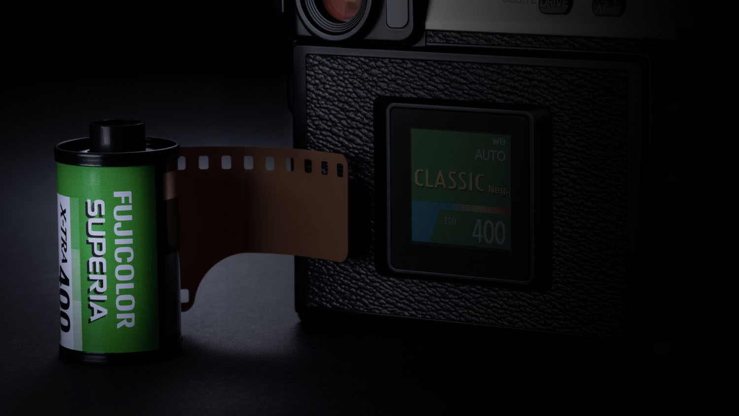
“CLASSIC Neg.”, the third negative film simulation, is modeled on SUPERIA film. Although we already have two other negative film simulations, those were designed with a particular process in mind—specifically, for taking photos under professional lighting. It sounds bad to say that SUPERIA is for amateurs, but I certainly don’t mean that it’s amateur-quality film, but rather that it’s designed for use in settings that are not professionally lit.
While the two “Pro Neg.” options are distinguished by their gentle tone gradations that can fully capture subtle lighting effects, “CLASSIC Neg.” is designed for slightly higher contrast in order to add depth to scenes with flat lighting. Like all negative films, however, it lacks saturation, offering less than the standard “PROVIA” option. In this respect, there is little to distinguish it from the two “Pro Neg.” simulations.
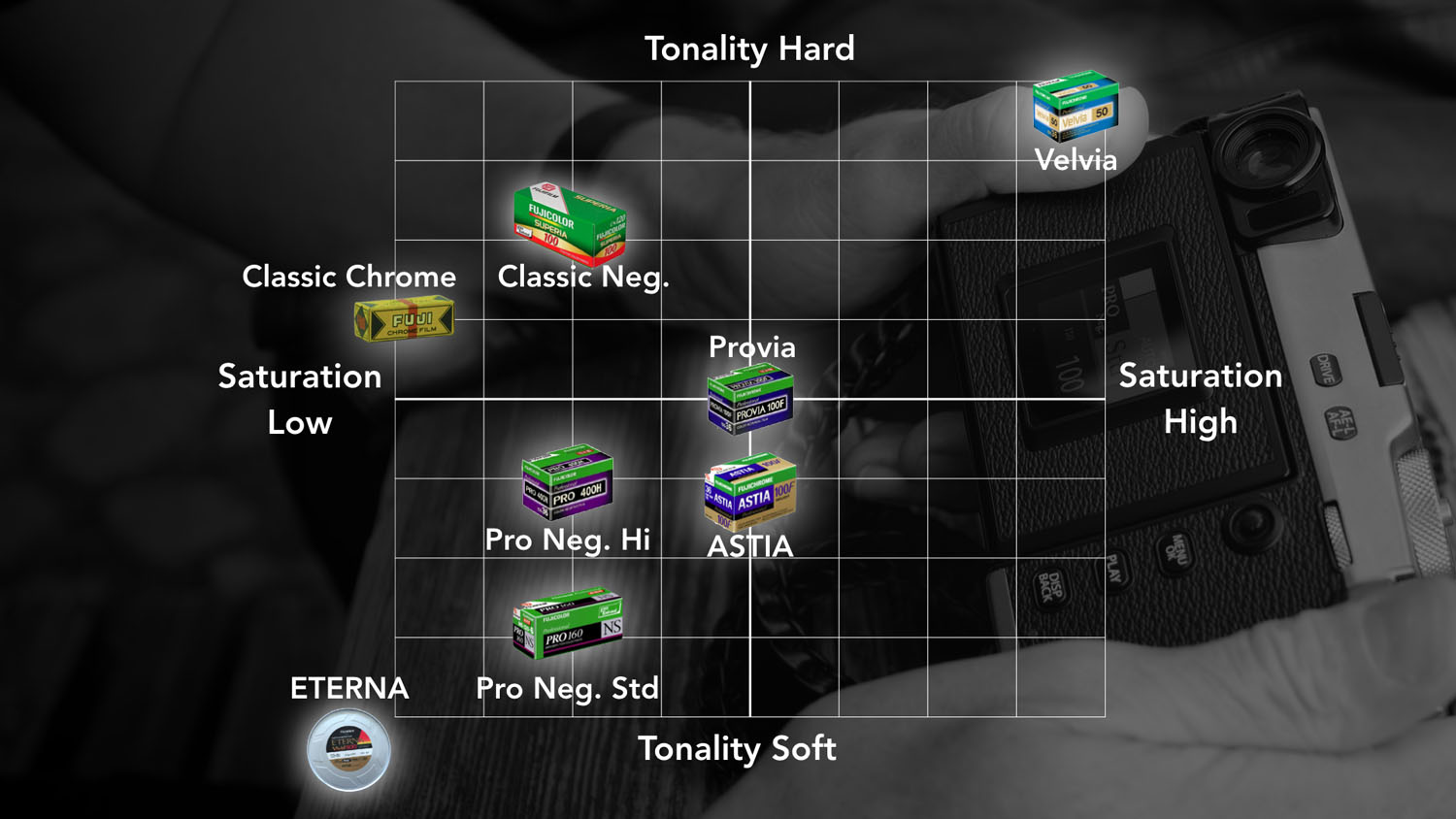
There is, however, more to the story. The most notable aspect of “CLASSIC Neg.” is a design that features tones customized by brightness for each color. Although the term may seem unfamiliar to some ears, at Fujifilm they are calling this “color (or color-by-color) contrast”.
Normally, one would think that that no matter what the color, the brighter the source—or other words, the higher the input—the higher the output. Put another way, one would expect that the brighter the scene, the more clearly each color will appear in the output. This is not, however, what we actually see expressed in photographs. What we see instead are photographs that don’t make much of an impression at all.
When faced with such a situation, we adjust tone curves to tighten shadows and blow out highlights. Carefully choosing the details we want visible and those we don’t brings our photographs to life. What would it be like, then, if Fujifilm were to do that work for us on a color-by-color basis? That just what the new “CLASSIC Neg.” film simulation does. With one color the relationship between input and output is linear, while with another output for inputs below a certain threshold brightness are reduced (which more or less means that the color will not appear as clearly in the output). Keeping output lower than the input brightness would suggest gives pictures a veiled feel that heightens the contrast between colors.
Let’s take a detailed look at how this effect is achieved with each of the key colors. Our model is a photograph taken with SUPERIA film and its print. One could call this a digital simulation of the chemical changes that take place in silver-halide film. The many light-sensitive layers are each embedded with silver-halide crystals of different sizes and a different color coupler, and consequently even if the amount of light remains the same, each layer undergoes different chemical changes, producing layered hues.
How is each color produced? What lends the picture depth? One could say that this is the key to the puzzle that skilled retouch artists have struggled with over the years. While knowledge built-up through R&D may be valuable, surely hands-on knowledge acquired through practical experience is also important. The key to “SUPERIA-like” color reproduction can be found by examining its greens, blues, and skin-tones. Speaking in terms of exposure, “CLASSIC Neg.” similarly achieves maximum expression when slightly over-exposed. These indeed are the colors of the negative film photographs we took in the days of our innocence, colors that are evocative without being old-fashioned.
All photographs taken with “CLASSIC Neg.”. © Stefan Finger