

HISTORY
Over 85 years of experience in image-making has led Fujifilm to being one of the world’s leading manufacturers of image-making products.
MISSION STATEMENT
Our visual storytellers exist in the split seconds between the seen and unseen. Gifted with elevated senses of perception and intuition, their love for the craft is only out measured by the purpose behind the stories they tell.
We exist to be part of the storytelling process; to be a connection between communities of image-makers across the world, collectively weaving a colorful tapestry of diverse perspectives into a single and cohesive message of unity, equity, and inclusion.
In the hands of our best, we are instruments of change and keepers of history. However, when we are at our best, that the world is reminded that everyone has a story and we will always be there when they are ready to share it.

Photo © 2020 Rinzi Ruiz
NAME USAGE
BASIC USAGE
Indicate the company name in one word as “Fujifilm.” In the past, “Fuji” or “FUJI” was often used as a corporate name or combined with product names. However, in order to promote Fujifilm as a corporate brand name, such usage is no longer allowed.
FUJIFILM IN A SENTENCE
In a sentence, use “Fujifilm,” not “FUJIFILM.” Only in official corporate names, use “FUJIFILM” as shown in the example right.
Example:
ABOUT FUJIFILM IN A SENTENCE
FUJIFILM Corporation is one of the major operating companies of FUJIFILM Holdings. Since its founding in 1934, the company has built up a wealth of advanced technologies in the field of photo imaging, and in line with its efforts to become a comprehensive healthcare company, Fujifilm is now applying these technologies to the prevention, diagnosis and treatment of diseases in the Medical and Life Science fields. Fujifilm is also expanding growth in the highly functional materials business, including flat panel display materials, and in the graphic systems and optical devices businesses.

Note: Never use “_Fuji_Film” or “Fuji_Film.”
*Exception: When writing the corporate color, “FUJIFILM Advanced Green”, the word “FUJIFILM” should be written in capital letters, as this color is an original corporate color used to promote the corporate image.
TYPOGRAPHY
TYPEFACES
Our typefaces are open source, available on Google Fonts, and should be kept to their specific uses. They should never be used outside of their designated applications. Styling and sizes should not be overly mixed, keeping to no more than three combinations in any single deliverable.
DOWNLOAD FONTS


TONE
Generally speaking, our tone is informal across the board, but we tend to be more witty and humorous on social media and more technical for product related communications. We know that each of our users are unique and have different skill levels and backgrounds, so we strive to adapt our tone in a way that is appropriate for that audience. For our users to feel connected with our brand, we try to imagine ourselves in their shoes and communicate in a relatable manner. For example, our tone is more light-hearted and conversational with beginners and more straightforward and detail oriented for experienced users. Above all else, we strive to make our tone inclusive and accessible.

Photo © 2020 Chris Knight
VOICE
At Fujifilm, we are dedicated to providing image-makers with content that instills emotion and purpose in everything they create. Our brand’s intrinsic value exists in how we honor and prefer meaningful touch stones with our audience. There is no question that we are fun, inspiring, and engaging – albeit a touch irreverent. We use industry-standard language that provides technical details, while also ensuring that the copy is simple and easy to read for novice users. Above all else, we believe in the power of storytelling and want nothing more than to bring focus to storytellers with purpose. To us, making images is a privilege. This is why we NEVER use words like “shoot,” “capture,” or “take”; rather we prefer to use “make” or “create”. These two words encapsulate our brand’s core values and communicates what we believe drives the creative process.

Photo © 2020 Karen Hutton
STYLE
When referencing Fujifilm’s inclusion in cross promotions such as giveaways, sponsorships and other initiatives, the following phrases are approved for use in marketing materials:
- Made possible by Fujifilm.
- Made possible through a partnership with Fujifilm.

Photo © 2020 Chinelle Rojas
LOGOS
01 FUJIFILM X/GFX
In most cases, this should be the primary logo used for the brand when communicating with our audience, partners, and our staff.
02 FUJIFILM GFX SYSTEM
Occasionally, the need will arise to use specific logos for either X Series of GFX System. While rare, these logos should never be used in combination with any other X Series or GFX Logos and should only be used in layouts that feature the products they are associated with.
03 FUJIFILM PRODUCT SPECIFIC
From time to time, the need will arise to have a product logo shown with the brand logo. However, use should be kept to a minimum and only reserved for specific needs related to the individual product and how it is being marketed to the public.
Download Logos
![]()
CLEARANCE & SIZING
The minimum amount of space surrounding the FUJIFILM logos is called the ‘clearance area’.
Nothing should ever encroach into this area, which is 40% of the ‘F’ height. All FUJIFILM logos should never be used at heights of less than 15mm or 43 pixels.
![]()
COLOR APPLICATION
There are several color variations of the logo, which gives us the flexibility to use it in different situations without sacrificing clarity.
- Choose a plain background, or imagery with an uninterrupted pattern.
- Make sure the red tittle of the ‘i’ is visible against the background – if not, use a monochrome variation.
- Edit the background to accommodate the logo; do not edit the logo.
CORRECT USES
BLACK WITH RED
The default choice for the FUJIFILM brand.
WHITE WITH RED
For use on darker backgrounds, when black text would not be legible.
ONLY BLACK OR WHITE
Useful for instances when the red tittle of the letter ‘i’ would be lost against the red background.
INCORRECT USES
Logo should only ever be full color, black or white. Never include the logo as an outline or with a frame or border around it.
DOs
![]()
Photo © 2021 Mio Minasch
![]()
Photo © 2020 Bryan Minear
DON’TS
![]()
Photo © 2020 Bryan Minear
![]()
Photo © 2019 Stefan Finger
![]()
Photo © 2019 Alison Conklin
![]()
Photo © 2020 Michael A. McCoy
COLORS
The core colors of Fujifilm are black, white, and red. The RGB and hex codes are detailed opposite: Any other colors used are to take influence from the imagery featured. For example, where an image has a lot of blue tones, a complementing blue should be used. Please use a color picker to do this and then adjust manually.
| RGB R: 0 G: 0 B: 0 HEX #000000 PANTONE Black C |
RGB R: 255 G: 255 B: 255 HEX #FFFFFF PANTONE White |
RGB R: 251 G: 0 B: 32 HEX #FB0020 PANTONE 185 C |
PRIMARY COLOR EXAMPLES
 |
 |
 |
 |
SECONDARY COLOR EXAMPLES
 |
 |
MEDIA
Images define the brand in both the emotions and stories they represent but also in the tacit associations they create visually for the viewer. Therefore, images used in connection with the brand must, first and foremost, be created using X Series or GFX System products. Additionally, all image content must be free from depictions of sex, drugs, alcohol, tobacco, and illegal substances. Third-party logos or trademarks must also not appear on clothing or in any other area within the image. This is especially applicable to hats, sports jerseys, and buildings.

Photo © 2020 Dinesh Boaz
| Photo Credits All photos need credits with the word “Photo” at the beginning, following the copyright symbol, year and photographers name, placed under the image. Example: Photo © 2020 Dinesh Boaz |
PRODUCT PHOTOGRAPHY
Images of Fujifilm products must always be sourced from an approved resource or pre-approved before alternative images are used. Generally speaking, cameras should always be shown with lenses attached, unless specific references are made to just the camera body alone. For camera bodies that also feature kits, it is preferred that an image of the kit be used unless specific references are made to the camera body, a different lens, or a combination of the two.
With respect to the position of the camera within the image, if the Fujifilm logo or name is visible, it must be oriented in such a way that it can be either partially or fully read and understood. If the camera has a name badge visible, the preference is to always have it visible, unless another angle is specifically needed, like a top-down version for example.
Lastly, our preference is to not have our cameras grouped with products from competitive brands.
However, if it is necessary, the camera badge and brand name must be visible at all times and the size and position of the product must be reasonably proportional to the competitive product.
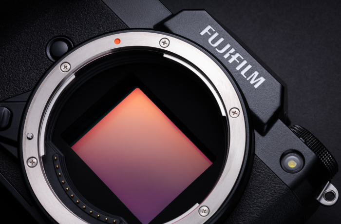 Photo © 2020 Jonas Rask
 Photo © 2020 Jonas Rask
 Photo © 2020 Jonas Rask
PRODUCT LIFESTYLE PHOTOGRAPHY
Product lifestyle images must be sourced from an approved resource or pre-approved if they are not. Generally speaking, lifestyle imagery should convey the excitement and joy of making images. They should incorporate a wide group of perspectives and be representative of our broadly diverse audience. Placement of products within lifestyle images should be complimentary to the overall aesthetic of the art direction. Products should never be displayed in situations outside of their intended use and purpose.
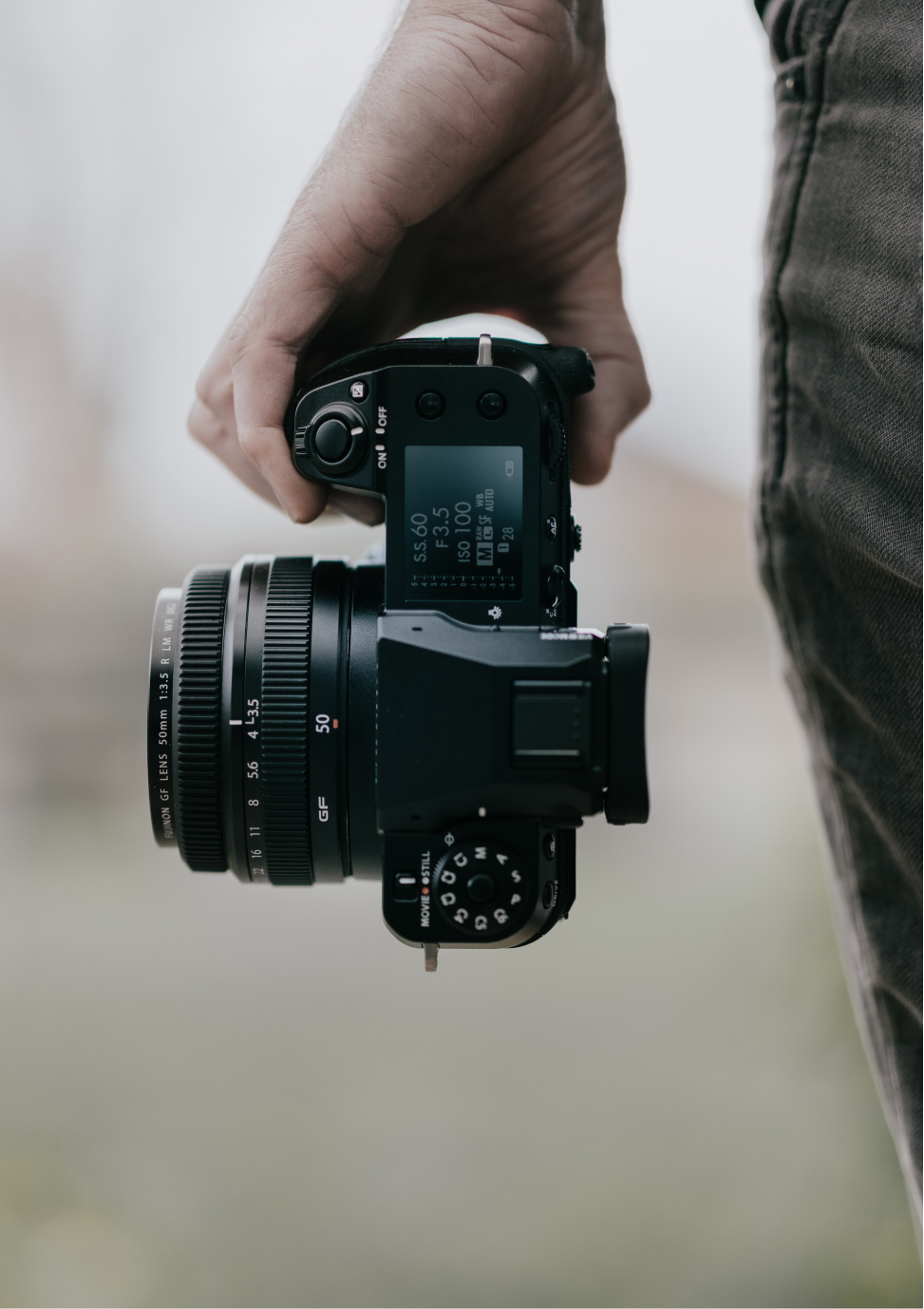 Photo © 2020 Jonas Rask
 Photo © 2021 Seth K. Hughes
 Photo © 2019 Bryan Minear
LIFESTYLE PHOTOGRAPHY
Lifestyle images without products must adhere to all image guidelines while also conveying the personality and values of the brand. Images used to represent the brand must be representative of our broadly diverse audience and incorporate perspectives that create a safe and inclusive space for our audience to envision themselves as a part of.
 Photo © 2019 Bryan Minear
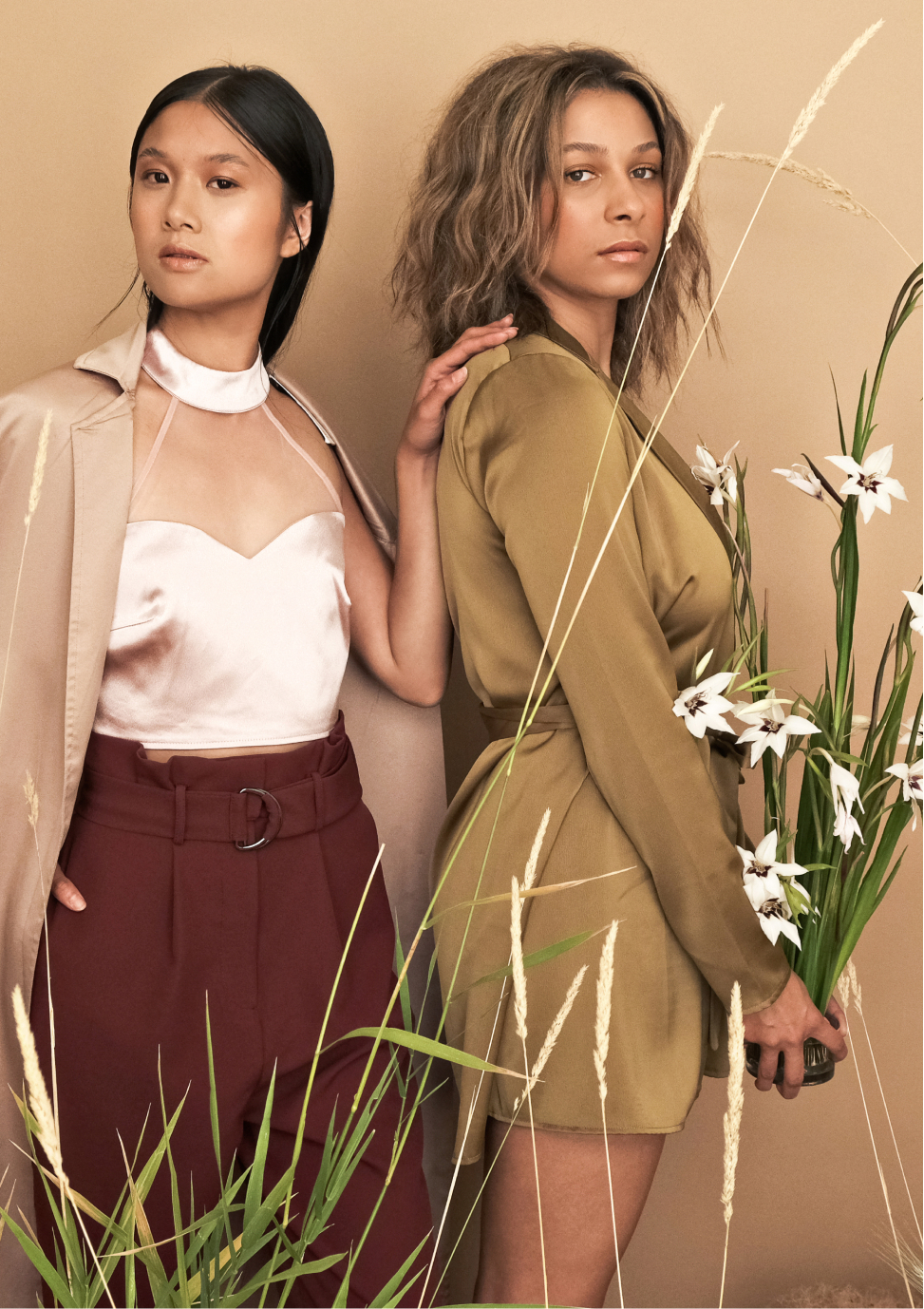 Photo © 2020 Kara Mercer
 Photo © 2019 Stefan Finger
MUSIC USAGE
If music is used in the video, you are required to secure and provide the brand with a royalty free music license. However, we strongly recommend that you confirm that the license you are purchasing allows for the song to be used in a deliverable that is being used commercially by a 3rd party.
Considerations when purchasing the license:
– It must be a commercial use license
– It should be for web only with accommodations for:
(i) in online streaming (YouTube, Vimeo, Netflix, Hulu, Amazon Prime)
(ii) Websites and social media
(iii) Web advertising (including as part of pre-roll advertising)
(iv) in Podcasts
VIDEOGRAPHY
Images define the brand in both the emotions and stories they represent but also in the tacit associations they create visually for the viewer. Therefore, images used in connection with the brand must, first and foremost, be created using X Series or GFX System products. Additionally, all image content must be free from depictions of sex, drugs, alcohol, tobacco, and illegal substances. Third-party logos or trademarks must also not appear on clothing or in any other area within the image.
TITLE AND END SEQUENCES
Only approved title and end sequences may be used in a video created for the brand. In all cases, unless otherwise noted, the brand will provide the approved asset for inclusion into the video. Depending upon the nature of the project, some modifications to the provided asset may be required, but in no instance will the modifications involve changing the look and feel of the asset itself.

At the conclusion of every video, an end card with a disclaimer and company logo must be displayed.
In some cases, the brand may require changes to the disclaimer and the logos that are displayed. This direction will always come after the video is delivered for initial review.
Lower third placement and design will vary from project to project. The brand will always provide direction and guidance on the specific needs that are required for this element.


